HTML Tutorials - Herong's Tutorial Examples - v2.30, by Herong Yang
Display Size of Image
This section provides a tutorial example on the display size of an image, which depends on the number of pixels in the image, the resolution of the virtual screen used by the Web browser.
Now let's look at images in this tutorial.
When you include an image in your HTML document, the first question you may ask is "How big is my image will look like on my viewer's screen?".
The answer depends on which Web browser the viewer is using and on which operating system the browser is running. Technically, HTML technology has no way to control how big the screen area to use for displaying your image. You may add CSS properties to the image to suggest the display area size. But it is up to the Web browser who decides image display area on viewer's screen.
Since images are made of pixels, an image should be mapped on the physical screen in an area with the same number of pixels as the image itself.
However number of pixels along does control how big an image appears on the screen in term of physical size like in inches. The other factor is the screen resolution.
Screen resolution is measured as PPI (Pixel Per Inch), or DPI (Dot Per Inch) as a pixel is also called a dot. PPI is calculated by dividing the number of pixels of the screen in one direction by the number of inches in the same direction.
For example, an old 14-inch XGA (eXtended Graphics Array) monitor, displays 1024 dots horizontally and 768 pixels vertically. The actually display area of the monitor is only 12.1 inches diagonally with a width (9.7 inches) to height (7.3 inches) ratio of 4:3. The monitor displays 1024 x 768 pixels in an area of 9.7 x 7.3 inches. So the resolution of the monitor is about 105 PPI in both directions.
If we display an image of 210 x 210 pixels directly on this 14-inch XGA monitor, the image will be 2 inches in size.
Now if we display the same image of 210 x 210 pixels on an iPhone X screen, the image will only be 0.46 inches in size. This is because the iPhone X screen has a resolution of 458 DPI, which can be calculated from the screen pixel size of 2436 x 1125 pixels, the diagonal length of 5.8 inches and the aspect ratio of 19.5:9.
When an image is included an HTML document and displayed on viewer's screen, the Web browser (and the operating system) may decide to map the image pixels to physical screen pixels directly, or not. And most Web browsers do not map image's pixels to screen pixels directly. They usually manage a virtual screen, which is mapped to the physical screen, to allow your screen to be configurable with different resolutions.
For example, my MacBook Pro computer has physical screen resolution of 1680 x 1050 pixels. But the macOS operating system running on my computer, allows me to set the virtual screen to be: 1024 x 768, 1280 x 800, 1440 x 900, or more.
When you set the virtual screen with different pixels than the physical screen, the screen resolution, PPI, is changed too.
The help you measure your virtual screen resolution used by your Web browser, I wrote the following HTML document, which uses CSS properties to suggest the browser to display 2 rulers: one in unit of pixels and one in inches.
<!DOCTYPE html>
<!-- Screen-Resolution-Horizontal-Test.html
 - Copyright (c) 2014 HerongYang.com. All Rights Reserved.
-->
<html><head>
<title>Screen Resolution: PPI (Pixel Per Inch)</title>
</head><body style="margin: 0px; padding: 0px">
<h4>Test on Screen Resolution: PPI (Pixel Per Inch)</h4>

<table border="0" cellspacing="0" cellpadding="0">
<tr><script>
for (i=0; i<30; i++) {
  document.write('<td><img src="Image-of-100-x-50-Pixel.png"'
    + ' width="100px" height="50px"></td>');
}
</script></tr>
<tr><script>
for (i=1; i<31; i++) {
  document.write('<td style="text-align: center; font-weight: bold;">'
    + (i*100) + ' px</td>');
}
</script></tr>
</table>

<table border="0" cellspacing="0" cellpadding="0">
<tr><script>
for (i=0; i<30; i++) {
  document.write('<td><svg xmlns="http://www.w3.org/2000/svg"');
  document.write('width="1.0in" height="0.5in" viewBox="0 0 100 50"'
    + ' stroke="rgb(255,0,0)" stroke-width="4">');
  document.write('<line x1="0" y1="48" x2="100" y2="48"/>');
  document.write('<line x1="50" y1="50" x2="50" y2="35"'
    + ' stroke-width="3"/>');
  document.write('<line x1="0" y1="50" x2="0" y2="30"/>');
  document.write('<line x1="100" y1="50" x2="100" y2="30"/>');
  document.write('</svg></td>');
}
</script></tr>
<tr><script>
for (i=1; i<31; i++) {
  document.write('<td style="text-align: center; font-weight: bold;'
    + ' color: #ff0000;">'+i+' in</td>');
}
</script></tr>
</table>

</body></html>
When this HTML document is displayed, you can take a physical ruler to compare the inch-ruler on the screen. In most cases, you see that the browser is not respecting CSS properties. One inch displayed is not one inch on your physical ruler.
The picture below shows you how the above HTML document is displayed on my MacBook Pro with two virtual screen resolutions.
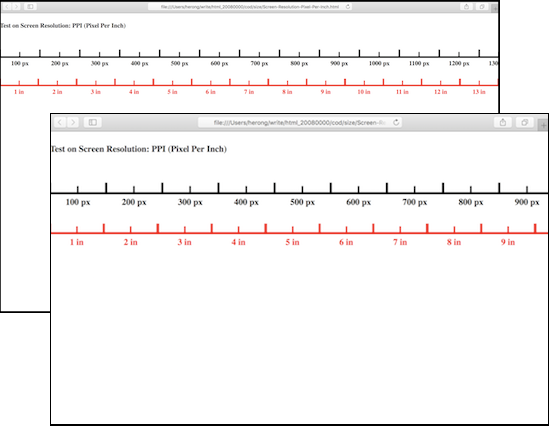
The top screen in the picture uses a virtual screen resolution that matches the physical screen resolution, because the inch-ruler matches well with the physical ruler (my physical screen is 13.1 in wide). The bottom one uses a lower virtual screen resolution. The inch-ruler appears to be enlarged.
From the virtual screen point of view, the PPI value stays unchanged as 96 pixel per inch independent of virtual resolution settings. But from the physical screen point of view, the PPI value changes as the virtual resolution changes, because the virtual inch changes comparing the physical inch.
Table of Contents
Introduction of HTML5 Features
HTML Document Structure and Content
HTML Document and Elements Syntax
►Displayed and Printed HTML Documents
Differences between Displayed and Printed HTML Documents
Default Font Family and Font Size
Printed Width of HTML Document
Printed Height of HTML Document
Text Paragraph Block Size and Overflow
Pagination Control of HTML Documents
Responsive Design of Web Pages